Catalog Heritage
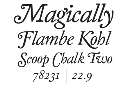
The past few months I’ve been working on a new type design project with the Japanese sports fashion brand Onitsuka Tiger in conjunction with Néojaponisme. I sat down with some folks at Onitsuka Tiger’s office in Tokyo to pore over the company’s vast archives of print advertising from the company’s advent in 1949 through around 1977, and to draw inspiration as I pleased for the design of a pair of digital fonts that help tell the story of Onitsuka Tiger as a brand.
Looking through the hundreds of ads, catalogs, brochures and assorted other materials, it became immediately clear that there was a bigger story to be told — the Onitsuka Tiger materials span the technological and cultural development of Modern printing. So I will be putting together a series of posts and essays here on Néojaponisme that document both the development of the typefaces and their cultural relevance to the continuum of type design.
The typography and graphic design of Onitsuka Tiger’s assorted printed materials provided a myriad of potential jumping-off points that span both Japanese and Western history, revealing a startling series of commonalities as well as interesting divergent moments in time.
From classical influence to highly futuristic, there is a huge gamut of interesting sources to pull from. Onitsuka Tiger’s printed promotions started in the age of metal typesetting, took advantage of phototype compositing in the 1960s through the 1980s, then entered the digital realm in the the 1990s. As a Japanese company that marketed domestically and abroad, the marketing department had to be aware of typographic trends internationally, and this was reflected in their printed materials. From the prevalence of American Type Founders typefaces used in early advertising mixed with hand lettering to incised prototype katakana and hiragana to the Helveticization of the globe, Onitsuka Tiger functions as a cultural and aesthetic survey of popular styles and unique approaches to graphic design.
The two fonts created for this project are:
• Kirimomi Swash
A display typeface which is rooted in both classical form and the sharp edges of photoype lettering.
• Kirimomi Geometric Sans
A sans serif inspired by early geometric typefaces and the horizontal directionality of phototype text, yet designed to render immaculately on-screen and in print.
These digital fonts will be available for free download in the upcoming month.
Team Néojaponisme are a-okay. Thanks for asking.


March 31, 2011 at 10:27 pm
[…] Tiger in conjunction with Néojaponisme. You can read the first installment about the project here. var gaJsHost = (("https:" == document.location.protocol) ? "https://ssl." : "http://www."); […]
April 4, 2011 at 3:45 pm
[…] Tiger in conjunction with Néojaponisme. You can read the first installment about the project here. Prev | […]
April 11, 2011 at 7:12 pm
[…] with Ian and Marxy over at Néojaponisme about the heritage of Onitsuka Tiger, around work they’re doing with us this year. What is the point for a brand like ours to promote a certain idea of Japan? What message […]